Dexagon
Dexagon is at the forefront of quantitative and technological investment solutions for the insurance and re-insurance industry.
CLIENT: Dexagon
PROJECT YEAR: 2023
SERVICES: Branding / UX/UI Design / Website Design
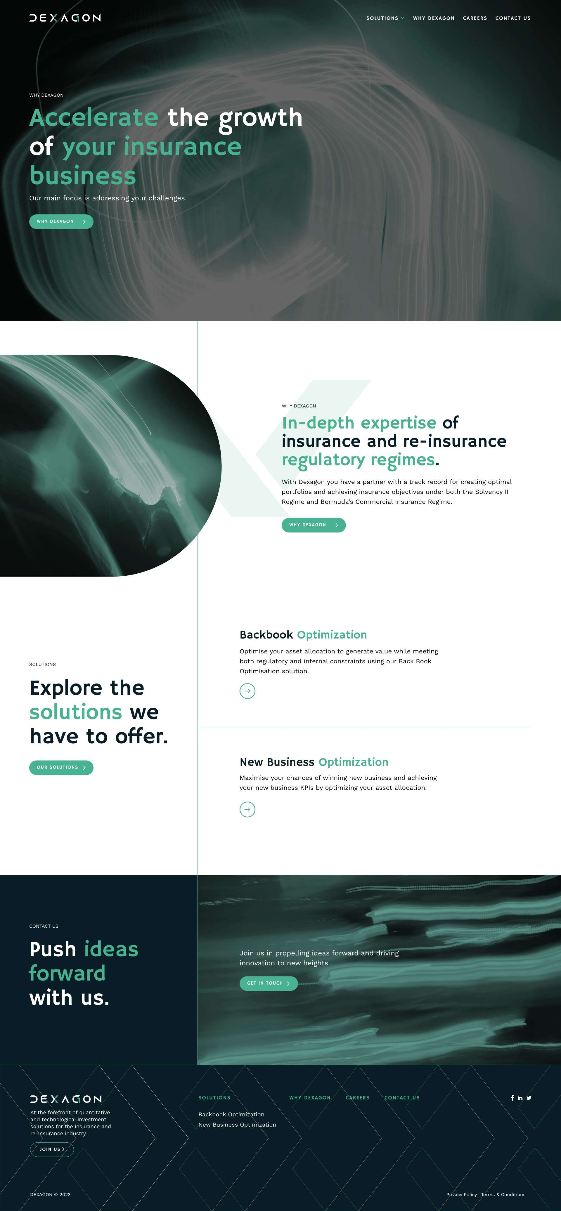
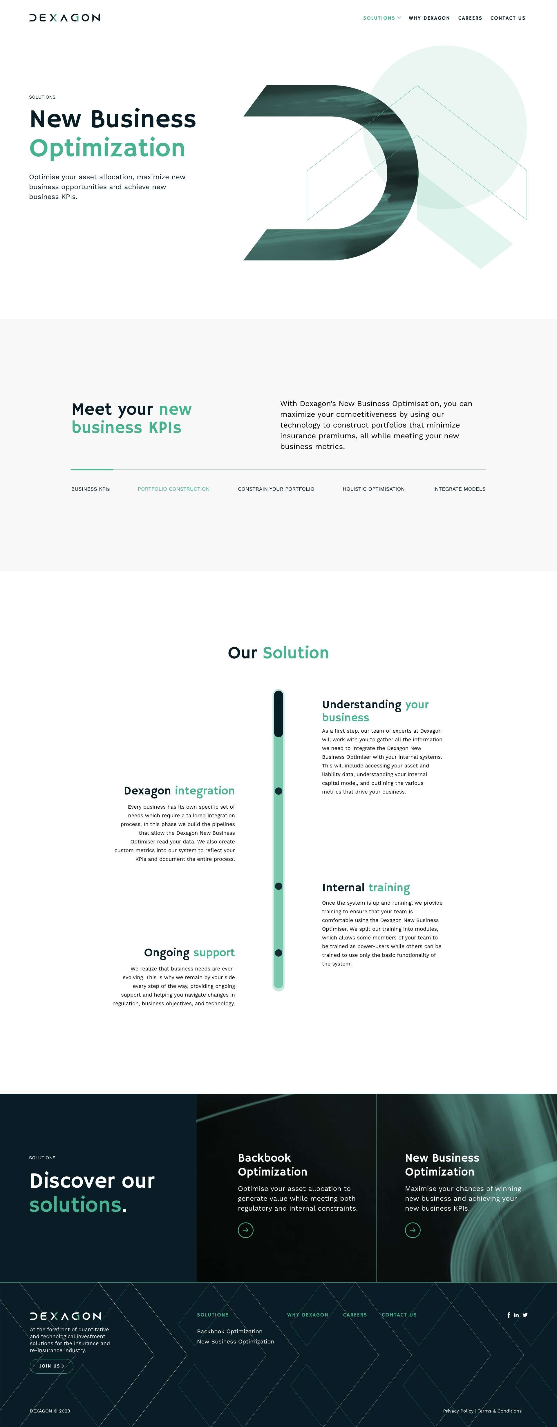
Dexagon is at the forefront of quantitative and technological investment solutions for the insurance and re-insurance industry. They seeks to bring order to the chaos of variables found in insurance and re-insurance businesses, by using technology and quantitative frameworks. Their aim is to solve problems once and to solve them well, after which they allow the technology to apply the solution on a day-to-day basis.
The name 'Dexagon' is deeply rooted in the founder's Greek heritage and mathematical background. The name draws its inspiration from the Greek word "decagon," which refers to a polygon with ten sides and ten congruent interior angles. The founder, being a mathematician, holds a deep fascination for decagons as they are an essential element in geometry that provide a foundation for understanding more complex shapes and concepts. In addition, the shape of a decagon also symbolises the idea of completeness. Just as a decagon is a complete shape with ten sides, the company offers comprehensive and holistic solutions. Finally, the geometric precision of a decagon represents the accuracy and attention to detail, reflecting the company's dedication to delivering high-quality products and services.
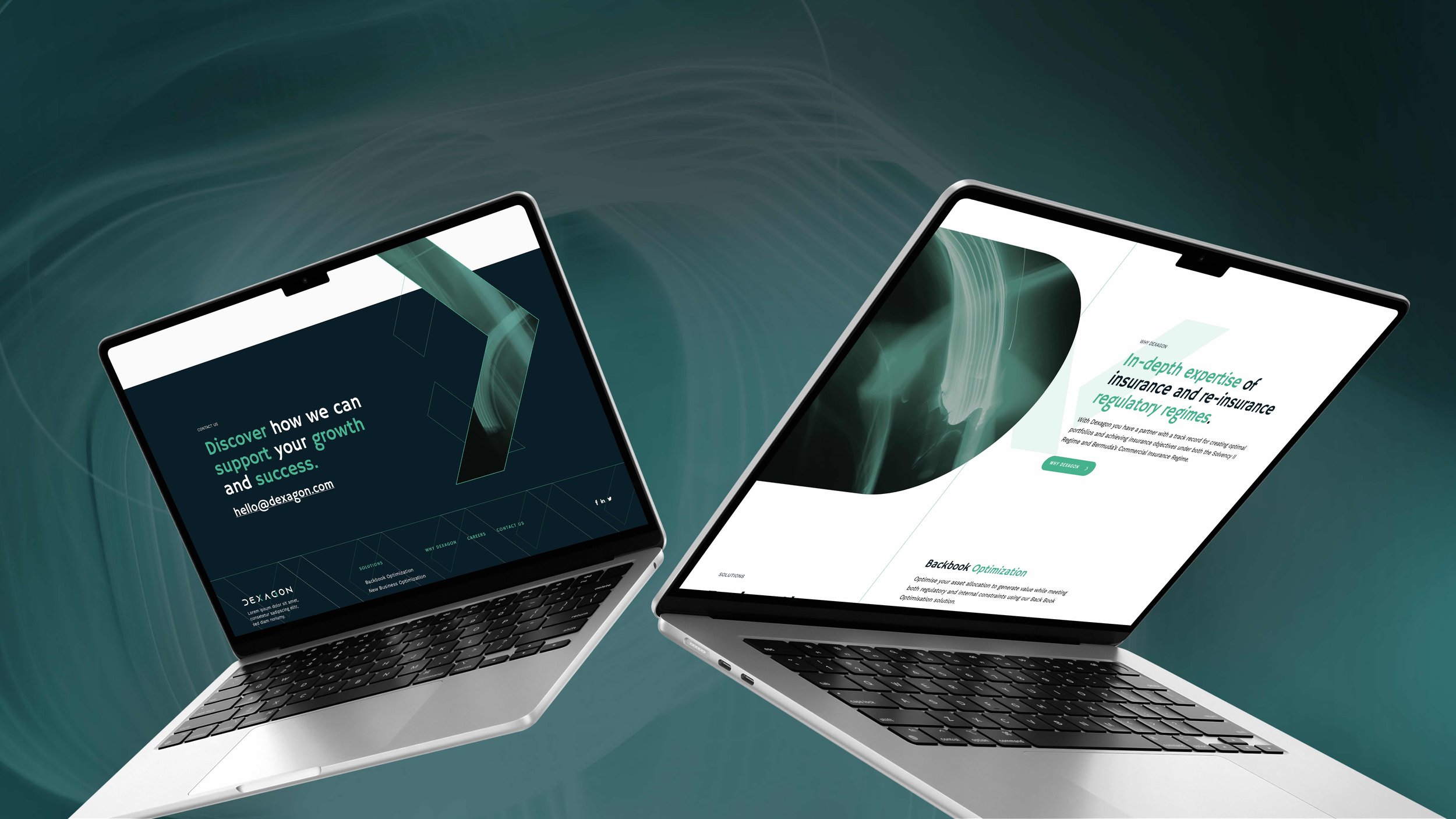
Command’s role was to create a brand that was innovative, techy, and forward thinking.
The website was developed by our partner Sorvus Media
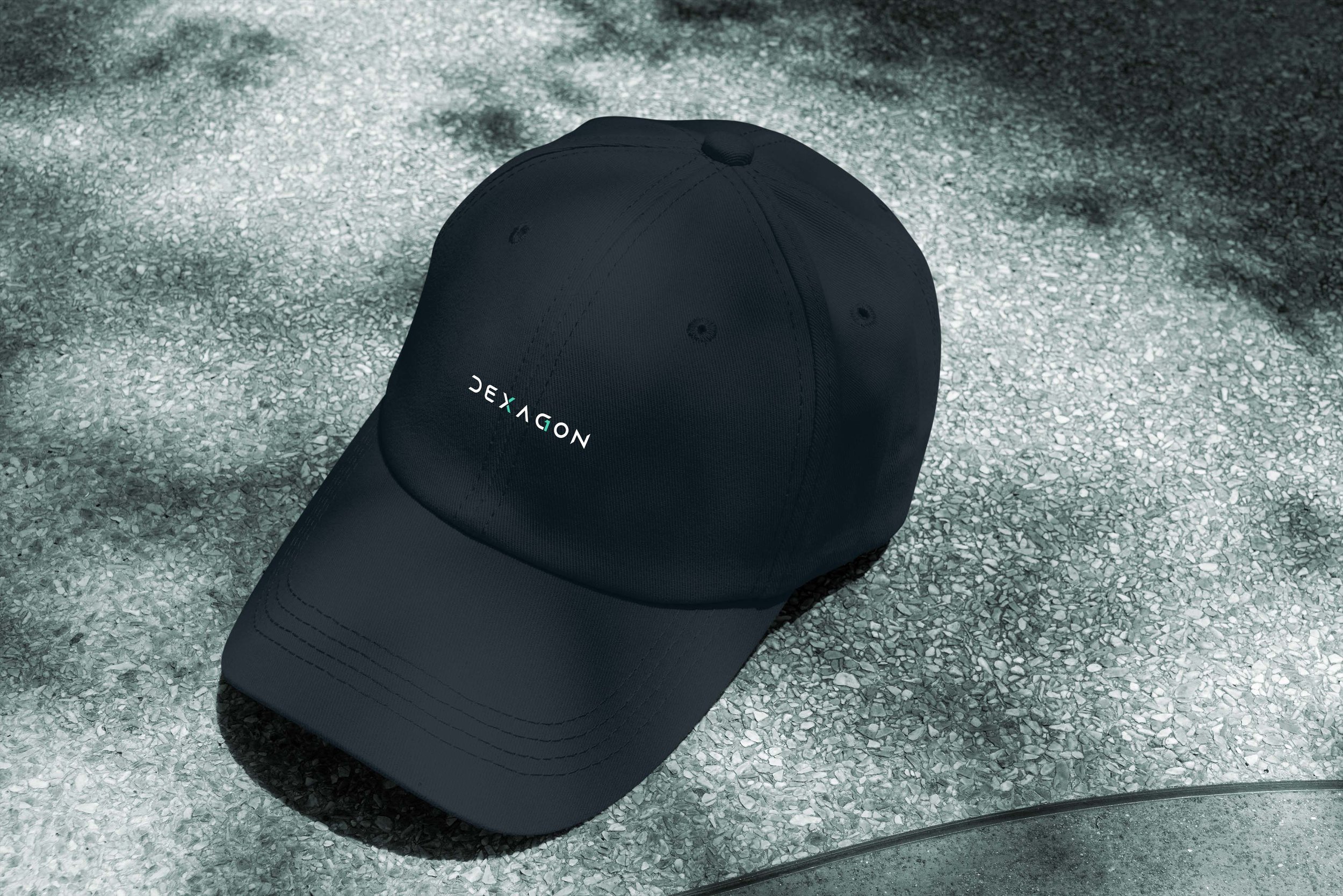
The logo anatomy includes a customised Sans Serif font with multiple hidden messages. The customisation of letter ‘G’ with the addition of number ‘1’ conceptually forms the number ‘10’ in a backward format. This is a reference to the Decagon shape as well as the website URL of the company which is 10gon.com. This synergy between the logo and web address enhances brand consistency and makes the URL memorable for customers and website visitors. This addition is not only aesthetically pleasing but also communicates a coherent message that reinforces the brand identity, aligning perfectly with the company's name, mathematical roots, and online presence.
All logo characters are customised to have sharp and pointy edges to symbolise fast forward thinking and cutting edge technology. Finally, The customisation of letter ‘X’ to form a subtle arrow, conveys once again the message that the company is always looking ahead and embracing new ideas and advancements.